
When it comes to choosing a color scheme for your home decor, there are various factors to consider. While there are no strict rules, following certain tips can help you create a harmonious and stylish color palette that reflects your personal style and brings balance to your space. These tips include starting with room elements that are less flexible, such as furniture or fabrics, considering the value of colors, mapping out your home’s color scheme, and thinking about how lighting impacts colors.
Key Takeaways:
- Start with room elements that are less flexible, such as furniture or fabrics.
- Base your color choices on an image or item you love, such as artwork or a patterned fabric.
- Consider the value of colors and incorporate a mix of light and dark hues.
- Map out your color scheme by assessing the positive and negative attributes of each space.
- Take into account the impact of lighting on colors and how different light sources can alter their appearance.
Start with Room Elements
When it comes to choosing a color scheme for your home decor, it may seem logical to start with selecting a paint color. However, experts recommend starting with room elements that are less flexible, such as furniture, fabrics, tile, or wallpaper. By selecting these foundational elements first, you can build your color palette around them and create a cohesive and harmonious look for your space.
Choosing furniture, fabrics, tile, or wallpaper as your starting point allows you to establish a color scheme that complements these elements. These room elements tend to have a longer lifespan and can be more challenging to change, so it’s vital to select colors that will coordinate well with them.
For example, if you have a vibrant patterned sofa that you love, you can pull colors from the fabric to inspire your color scheme. Incorporating similar shades or complementary hues in your wall color and accent pieces can create a visually pleasing and coordinated space.
Additionally, starting with room elements gives you a solid foundation to build upon when selecting paint colors. You can choose paint shades that enhance and harmonize with your chosen furniture, fabrics, tile, or wallpaper.
By starting with room elements, you ensure that your color scheme is cohesive and well-integrated throughout your space. Each color in the scheme will complement and enhance the others, resulting in a visually appealing and unified design.
Benefits of Starting with Room Elements
- Creates a cohesive and harmonious color scheme
- Allows you to coordinate wall colors with furniture, fabrics, tile, or wallpaper
- Provides a solid foundation for your overall design
- Ensures that the colors in your space complement and enhance each other
Starting with room elements when choosing a color scheme is a strategic approach that sets the tone for your entire decor. By selecting foundational elements first, you can create a beautiful and coordinated space that reflects your personal style.
| Pros | Cons |
|---|---|
| Establishes a cohesive color scheme | Requires careful selection of room elements |
| Allows for seamless integration of paint colors | May limit flexibility in later design choices |
| Creates a visually pleasing and coordinated space |
Base Your Choices on an Image or Item You Love
An easy way to create a color scheme is to base your choices on an image or item you love. This could be a piece of artwork, an area rug, a photo you saw online, or a patterned fabric that appeals to you. By drawing inspiration from something that resonates with you, you can infuse your personal style into your home decor.
Take a close look at the specific shades within the design or image. What colors stand out to you the most? Are there any hues or tones that evoke a particular emotion or feeling? These are the colors you can incorporate into your decorating choices.
Let’s say you have a vibrant piece of artwork featuring bold reds and blues. You can use these colors as a starting point and build your color scheme around them. Consider using the red as an accent color on furniture or as an accent wall, while the blue can be incorporated through accessories or fabrics.
When applying the colors from your chosen image or item, pay attention to the proportions of each shade. Aim for a balanced interior color scheme by considering the visual weight of each hue. For example, if the artwork predominantly features red, you may want to use it as the dominant color in your room while incorporating smaller doses of the secondary colors.
Creating a color scheme based on an image or item you love allows you to infuse your space with a sense of personal connection and style. It provides a starting point for selecting complementary colors and ensures a cohesive look throughout your home.
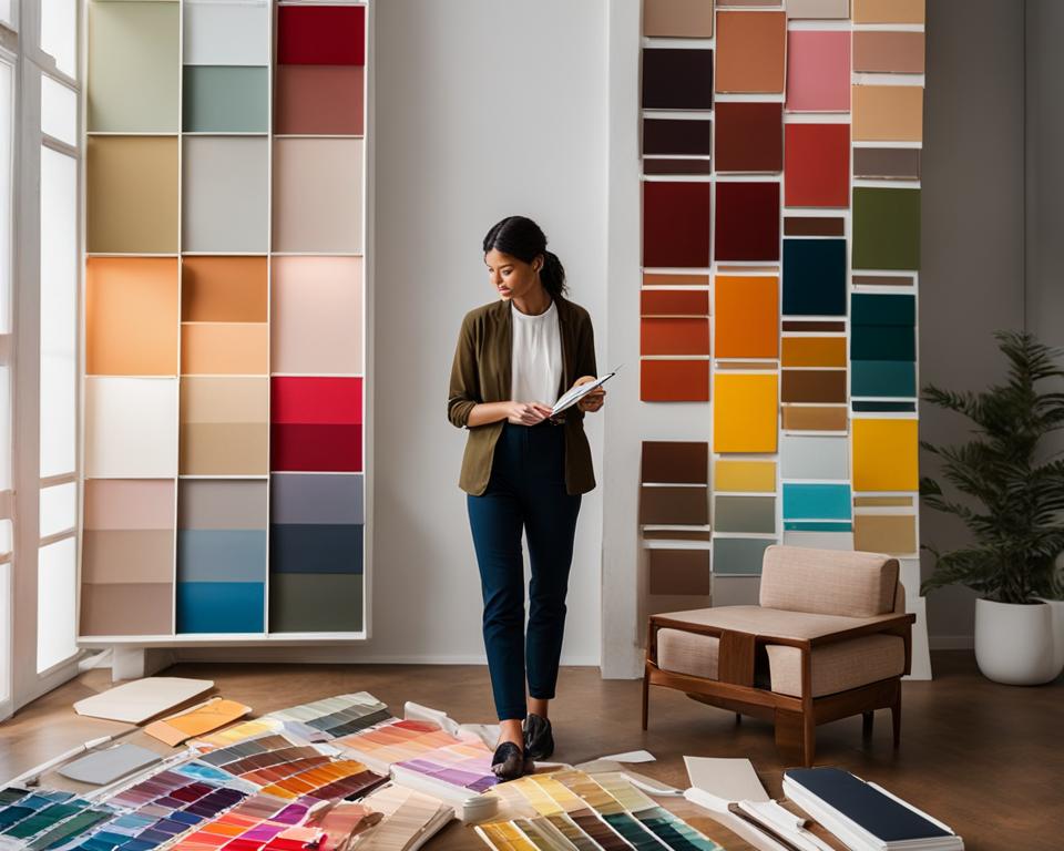
For inspiration, take a look at this beautiful image:

Consider the Value of Colors
When choosing colors for your color scheme, it is important to consider the value, which refers to the lightness or darkness of a hue. By carefully selecting the values within your color palette, you can maintain a balanced and harmonious multi-hue scheme that is visually appealing. To achieve this, aim for a mix of dark, light, and bright colors in each room.
Consider selecting one dark color, such as a deep navy blue or charcoal gray, to add depth and richness to the space. This darker hue can anchor the room and provide a sense of grounding. Next, choose one light color, like a pale cream or soft pastel, to bring brightness and airiness. This lighter hue can create a sense of openness and spaciousness. Finally, incorporate one bright color, such as a vibrant red or sunny yellow, to inject energy and personality into the room.
The dominant hue can be chosen based on your personal preference and the desired atmosphere you want to create in each room. If you prefer a clean and bright aesthetic, opt for lighter values of colors. For a softer and more subtle ambiance, choose darker values.
As you can see in the image above, using a range of values within a color scheme adds depth and dimension to the overall design. The combination of light, dark, and bright colors creates visual interest and prevents the palette from looking monotonous or overwhelming.
Remember, the value of colors plays a crucial role in the overall mood and atmosphere of your space. By considering the lightness or darkness of your chosen hues and incorporating a mix of values, you can create a beautiful and balanced multi-hue palette that enhances your home decor.
Map Out Your Color Scheme
Before finalizing your color scheme, it can be helpful to map it out. By drawing a plan of your home and listing the colors of each element, such as the carpet, wall colors, and furniture, you can get a visual representation of how the colors will work together. To ensure a cohesive look and feel throughout your home, consider using one color in different proportions in all rooms.
Assessing the spaces for both positive and negative attributes is essential in creating a harmonious color scheme. Take note of the positive attributes such as ample natural light, architectural features, or beautiful views that you want to highlight. On the other hand, identify any negative attributes such as low lighting, small spaces, or unsightly elements that may need to be minimized or camouflaged with color.
Another important factor to consider when mapping out your color scheme is the flow between rooms. Think about how one room will transition into the next and ensure a seamless connection. One way to achieve this is by selecting a color palette that shares common hues or undertones. This will create a sense of continuity and unity throughout your home.
To help you visualize your color scheme, create a mood board or gather paint samples, fabric swatches, and images of furniture and accessories that reflect your desired color palette. This will serve as a reference when making purchasing decisions and ensure that your chosen colors work well together.

Mapping out your color scheme allows you to carefully plan each room’s color palette one at a time. This approach ensures that each space in your home receives the attention it deserves and creates a cohesive and inviting atmosphere. Remember to consider positive and negative attributes, flow between rooms, and use visual aids to bring your color scheme to life.
Consider Lighting Impact
When it comes to choosing a color scheme, it’s important to consider the impact of lighting in your space. Lighting plays a significant role in how colors are perceived, whether it’s natural light streaming in through windows or the glow of artificial light from lamps and fixtures.
Natural light is often considered the ideal light source as it showcases colors in their truest form. However, it’s essential to understand how natural light changes throughout the day and how it can affect the appearance of colors in your space. Colors can vary in intensity and warmth depending on the time of day, so it’s crucial to choose colors that react well to different lighting conditions.
Additionally, artificial light sources such as incandescent and fluorescent lamps have different color temperatures, which can impact how colors are perceived. Incandescent light tends to have a warm, yellowish tone, while fluorescent light is cooler and bluish. Considering the color temperature of artificial light is important when selecting colors for fabrics, paints, furniture, and other surfaces in your home.
By taking into account both natural and artificial lighting in your space, you can make informed color selections that will complement the overall ambiance and create the desired atmosphere.
For more inspiration and guidance on choosing a color scheme, continue reading the next section.
Add Color with Accessories and Accent Pieces
Adding color to your room doesn’t have to involve committing to a specific paint color. You can effortlessly infuse color into your space by incorporating accessories and accent pieces that bring vibrancy and personality. By strategically using fabrics, textiles, artwork, and natural elements, you can create a visually appealing color scheme that enhances the overall ambiance of your home. Embrace the opportunity to showcase your unique style and create a space that reflects your individuality.
Fabrics and Textiles
One of the easiest ways to add color to a room is through fabrics and textiles. Consider incorporating vibrant and patterned rugs, pillows, throws, and window treatments. These elements not only provide pops of color but also add texture and visual interest to your space. Experiment with different colors and patterns to find the perfect combinations that complement your existing decor.
Artwork and Accessories
Artwork and personal collections can act as colorful accents in your home. Hang paintings or prints that feature bold colors or showcase your personal style. Sculptures, decorative vases, and other unique accessories can also contribute to the overall color scheme. Remember to consider the size, shape, and color of these items to ensure they harmonize with the rest of your decor.
Natural Elements
Don’t overlook the vibrant hues found in nature. Incorporate natural elements such as flowers and fruit to add bursts of color to your space. Arrange colorful blooms in vases or display a bowl filled with fresh fruit as a colorful centerpiece. These natural elements not only bring color but also add life and freshness to your room.
By incorporating these accessories and accent pieces, you can easily add color to your space without making a permanent commitment to a specific paint color. Embrace your creativity, and let your personality shine through in your color selections.
| Accessories and Accent Pieces | Benefits |
|---|---|
| Fabrics and Textiles | – Adds pops of color and pattern – Provides texture and visual interest – Can be easily changed or replaced |
| Artwork and Accessories | – Acts as colorful accents – Showcases personal style and interests – Adds a unique touch to the space |
| Natural Elements | – Brings vibrant hues from nature – Adds life and freshness to the room – Provides a colorful focal point |
The Benefits of Using Color in Your Home
While neutrals might seem safe, using color in your home can have many benefits. Color has the power to transform a space, unite furniture styles, and create a personalized and stylish atmosphere. With the right color choices, you can manipulate the perception of space, breathe new life into worn-out furniture, and enhance the overall aesthetic of your home.
One of the key benefits of using color in your home is its ability to unite disparate furniture styles. By incorporating a cohesive color palette, you can bring together different furniture pieces and create a harmonious look. Whether you have a mix of vintage and modern furniture or a combination of styles, color can tie everything together, creating a visually pleasing and cohesive space.
“Color has the power to transform a space, unite furniture styles, and create a personalized and stylish atmosphere.”
Another advantage of using color is its ability to breathe new life into worn-out or outdated furniture. Instead of replacing old pieces, a fresh coat of paint or vibrant upholstery can give furniture a renewed and refreshed appearance. With a little creativity and the right color choice, you can turn tired furniture into statement pieces that enhance the overall look of your home.
Color also plays a crucial role in manipulating the perception of space. Light colors can make small rooms appear larger and more spacious, while darker colors can create an illusion of coziness and intimacy. By strategically selecting colors for walls, ceilings, and furniture, you can visually enhance or alter the size and layout of a room, making it more inviting and aesthetically pleasing.
Visual tricks can be achieved by using color to manipulate the height of a room’s ceiling. Darker colors can make a high ceiling appear lower and cozier, giving the space a more intimate feel. On the other hand, lighter colors can make a low ceiling appear higher, creating a sense of openness and airiness. By utilizing these visual tricks, you can create a balanced and harmonious space that meets your aesthetic preferences and enhances the overall ambiance of your home.
Understanding the power of color is key to making impactful choices in your home decor. By purposefully selecting and incorporating color into your living spaces, you can create a personalized, vibrant, and visually appealing environment that reflects your unique style and personality.
So don’t shy away from incorporating color into your home. Embrace the benefits it offers and create a space that truly feels like yours.
Choosing a Color Scheme in an Open Floor Plan
When it comes to selecting a color scheme for an open floor plan, it’s important to create a cohesive look that flows seamlessly from room to room. While you don’t have to use the same tones in every space, the colors should work together harmoniously. Let the architecture of your home guide you when transitioning between colors, using corners and transition areas as natural stopping and starting points for paint colors or wall treatments.
You can also use your chosen color scheme to define distinct spaces within the open plan. One way to do this is by using molding and paint to create color blocks, separating different areas visually. Another option is to use rugs or casework to create clear boundaries between spaces. These design elements not only add visual interest but also contribute to the overall flow and functionality of your open floor plan.
| Tip | Explanation |
|---|---|
| 1. Room Transitions | Use corners and transition areas as natural stopping and starting points for paint colors or wall treatments. |
| 2. Accent Walls | Create color blocks or accent walls to define distinct spaces within the open floor plan. |
| 3. Distinct Spaces | Use rugs or casework to separate different areas visually and define specific zones. |
| 4. Wall Treatments | Consider using molding or other architectural details to add visual interest and create boundaries. |
Tips for Choosing a Color Scheme
When it comes to choosing a color scheme for your home decor, finding inspiration is crucial. Look to nature, magazines, or online platforms like Pinterest for color palette ideas that align with the look you want to achieve in your space. Instead of following trends, focus on colors that personally resonate with you, whether it’s the hues you love in your wardrobe or the ones you encounter during your favorite travel destinations.
It’s also important to consider the lighting in your space and how it can impact the appearance of different colors. Natural light and artificial light from lamps can alter the way colors are perceived. Take time to understand how lighting changes throughout the day and how it affects the colors in fabrics, paints, furniture, and other surfaces.
To accurately visualize how colors will look in your space, use paint swatches to test colors on your walls. This allows you to see how they appear under different lighting conditions and at various times of the day. It’s also helpful to compare different colors side by side to find a combination that creates a cohesive and pleasing aesthetic.
When working with a color scheme, it’s best to work with three to five colors. This range helps avoid a chaotic look and allows for a more harmonious color selection. You can choose one dominant color and then incorporate secondary and accent colors to create depth and visual interest in your space.
Conclusion
Choosing a color scheme for your home decor is an exciting and personal endeavor. By following the tips and guidelines provided in this article, you can create a color palette that not only reflects your personal style but also brings harmony and cohesion to your space.
Start by considering your room elements such as furniture, fabrics, tile, or wallpaper, and build your color scheme around these fixed elements. This ensures a cohesive look throughout your home. Consider the value of colors, including the lightness or darkness of hues, to create balance in your color palette.
Mapping out your color scheme and considering lighting impact are essential steps in creating a harmonious color palette. Pay attention to how natural and artificial lighting affects the appearance of colors, and plan accordingly. Adding color through accessories and accent pieces is another great way to infuse your space with personality and vibrancy.
Remember, there are numerous benefits to using color in your home decor. Colors can transform a dull room into a stylish and personalized space, bring new life to worn-out furniture, and create visual tricks to manipulate room size and ambiance. By drawing inspiration, trusting your personal preferences, and working with three to five colors, you can curate a color scheme that is unique to your personal style and creates a harmonious atmosphere in your home.
FAQ
How do I choose a color scheme for my home decor?
There are various factors to consider when choosing a color scheme for your home decor. Following certain tips can help you create a harmonious and stylish color palette that reflects your personal style and brings balance to your space.
Where should I start when choosing a color scheme?
It is recommended to start with room elements that are less flexible, such as furniture, fabrics, tile, or wallpaper. These elements provide a foundation for your color scheme and can be more challenging to change later on. By selecting these elements first, you can then choose paint colors that complement and harmonize with them, creating a cohesive look for your space.
How can I base my color scheme on an image or item I love?
An easy way to create a color scheme is to base your choices on an image or item you love. This could be a piece of artwork, an area rug, a photo you saw online, or a patterned fabric that appeals to you. Look at the specific shades within the design and apply them to your decorating choices. Pay attention to the proportions of each shade to recreate a balanced interior color scheme.
What does considering the value of colors mean?
When choosing colors for your color scheme, it is important to consider the value, which refers to the lightness or darkness of a hue. A mix of values within your color scheme helps to keep a multi-hue palette from looking chaotic. Try selecting one dark color, one light color, and one bright color in each room. The dominant hue can be chosen based on your personal preference, whether you prefer clean and bright or soft and subtle colors.
Why should I map out my color scheme?
Before finalizing your color scheme, it can be helpful to map it out. Draw a plan of your home and list the colors of each element, such as the carpet, wall colors, and furniture. Assess the spaces for both positive and negative attributes and consider how one room will flow into the next. Find focal points and plan each room’s color scheme one at a time. For a cohesive whole-home color palette, consider using one color in different proportions in all rooms.
How does lighting impact color?
Lighting significantly impacts how colors appear in a room. Different types of lighting, such as natural light or artificial light from lamps, can change the way colors are perceived. Consider how lighting affects color in fabrics, paints, furniture, and other surfaces. Daylight is considered the perfect light source, and understanding how natural light changes throughout the day can help you choose colors that react well to different lighting conditions. Incandescent and fluorescent lamps also have different color temperatures that can influence how colors are perceived.
How can I add color with accessories and accent pieces?
Adding color to a room doesn’t have to mean committing to a specific paint color. You can add color through accessories and accent pieces. Fabrics and textiles, such as rugs, pillows, throws, and window treatments, can provide pops of color and pattern. Artwork and personal collections can act as colorful accents. Don’t forget the vibrant hues of natural elements like flowers and fruit, which can be grouped in vases or bowls to create a colorful focal point in any space.
What are the benefits of using color in my home?
While neutrals might seem safe, using color in your home can have many benefits. Color can unite disparate furniture styles and bring new life to worn-out or outdated pieces. A pop of color can transform a dull room into a stylish and personalized space. Colors can also manipulate your sense of space, making a small room appear larger with light colors or altering the perception of ceiling height with dark or light colors. Understanding the power of color can help you make impactful choices in your home decor.
How do I choose a color scheme in an open floor plan?
Selecting a color scheme for an open floor plan can be a challenge. While you don’t have to dress every space in the same tones, the color scheme should appear cohesive from room to room. Let architecture guide you when transitioning between colors, using corners and transition areas as natural stopping and starting points for paint colors or wall treatments. You can also use your chosen color scheme to define distinct spaces within the open plan, such as using molding and paint to create color blocks or separating areas with rugs or casework.
What tips can you provide for choosing a color scheme?
When choosing a color scheme, seeking inspiration is key. Look at nature, magazines, or online platforms like Pinterest to find inspiration that matches the look you want to achieve for your space. Instead of following trends, focus on colors that you love personally and are drawn to in your wardrobe or favorite travel destinations. Consider the lighting in your space and how it can affect the appearance of colors. Use paint swatches to test colors on your walls and see how they look throughout the day. Compare colors to find a cohesive combination. Work with three to five colors to avoid a chaotic look.
What should I keep in mind when choosing a color scheme for my home decor?
Choosing a color scheme for your home decor is a personal and creative process. By following the tips and guidelines mentioned in this article, you can create a color palette that reflects your personal style and brings harmony to your space. Start with room elements, consider the value of colors, map out your color scheme, pay attention to lighting, and add color through accessories. Remember the benefits of using color in your home and make thoughtful choices in an open floor plan. Use inspiration, personal preferences, and the play of color tones to curate a color scheme that feels uniquely you.